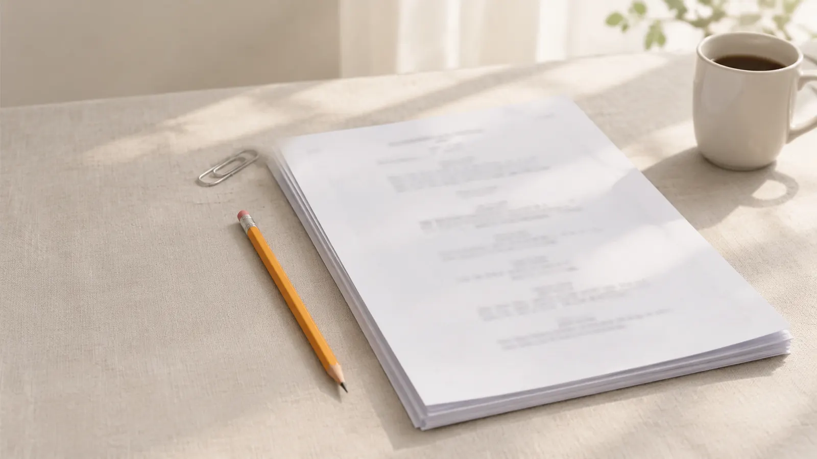
The screenplay font is Courier at 12 points — a monospaced typewriter face in which every character is the same width, giving exactly 10 characters per inch and 6 lines per inch. That fixed grid is what lets one script page stand for roughly one minute of screen time.
Any member of the Courier family is acceptable, and most writers today use Courier Prime, a redesign made specifically for screenplays. What matters is the size and the spacing, not the brand name on the font file.
What font are scripts written in?
Film and TV scripts in the US are written in 12-point Courier or a close variant such as Courier Prime or Courier New. Agents, readers, producers and production departments all expect it, and a script set in anything else looks wrong before a word of it has been read.
The convention comes from the typewriter. For decades scripts were typed on machines that gave every letter the same slot, and the page layout, the margins and the page-per-minute rule of thumb were all built around that output. When writing moved to computers, the font moved with it so that page counts would stay comparable.
Why monospacing matters for timing
In a monospaced font an i takes as much room as an m. A line of dialogue therefore takes up space in proportion to the number of characters in it, not the shapes of the letters, and so does the page. Combined with fixed margins, that makes page count a usable stand-in for running time: about 55 lines per page, 60 characters across for action and roughly 35 across for dialogue.
A proportional font such as Times New Roman fits more words on every line. The same scene set in Times can come out noticeably shorter on paper, which makes a long script look tight and makes every scheduling estimate built on it wrong. Here is how a single speech wraps in a Courier dialogue column:
ROSA
You told me the bridge was closed
for repairs. I drove out there.
There is no bridge. There never
was a bridge.
Four lines of dialogue, each no wider than about 35 characters. In a proportional font the same words would fit on three lines, and across 110 pages those saved lines add up to several minutes the page count no longer shows.
Courier vs Courier New vs Courier Prime
All three share the same character width, so a script keeps the same page count in any of them. They differ in how they look on screen and in print.
- Courier: the original typewriter face from the 1950s. Several digital versions exist, and the one installed on your computer depends on the system.
- Courier New: the version bundled with Windows and Microsoft Office. Its strokes are thin, so it can look faint on screen and pale when printed.
- Courier Prime: a redesign drawn for screenwriters, released in 2013 under the SIL Open Font License, so it is free to use, embed in PDFs and share. It has heavier, more even strokes and true italics and bold. Its metrics match Courier, so swapping it in does not change the page count.
What size should the screenplay font be?
Screenplay font size is 12 points, everywhere — scene headings, action, dialogue, the title page. Smaller type or tighter line spacing to shave pages is easy for experienced readers to spot, and it breaks the timing the format exists to protect. If a draft is too long, cut scenes, not points.
Bold, italics and underline
Courier has no headings in larger type; emphasis comes from capitals, underlining, italics and sometimes bold. Common practice is to keep all of them rare: capitals for scene headings, cues, transitions and a character's first appearance; underline or italics for a stressed word in dialogue or a foreign phrase; bold, if at all, for scene headings. A page full of styled words stops being readable as a screenplay.
What font should a screenplay title page use?
The title page uses the same Courier 12 as the script. The title is usually in capitals, sometimes underlined or bold, and the credit, author and contact lines are plain. Decorative fonts, logos and images are generally left off a spec script's cover. The screenplay title page guide shows where each line goes.
Fonts for Chinese, Japanese and Korean scripts
Courier contains no Chinese, Japanese or Korean characters, and the US layout was never designed for them. CJK characters are full-width, so a line holds far fewer of them, punctuation behaves differently and each film industry has its own page conventions. The Courier page-per-minute arithmetic does not transfer directly. Write in a layout made for those languages rather than forcing a CJK script into a US page.
How to set up the screenplay font
- Install Courier Prime from a trusted source such as Google Fonts, or use the Courier that came with your system.
- Set the whole document — title page included — to 12 points with single line spacing.
- Check the margins: 1.5 inches on the left and about 1 inch on the right, top and bottom of a US Letter page.
- Export to PDF with the fonts embedded, so the reader sees the same pages you do.
The rest of the page rules are in the screenplay format guide.
Checking the font before you send a script
Fonts are one of the few things that can change between your screen and a reader's. A few checks before a script goes out:
- Open the exported PDF and look at its document properties: the fonts listed should be Courier or Courier Prime, marked as embedded.
- Compare the PDF's page count with your draft. If it changed, a font was substituted somewhere.
- Look at italics and bold. If they appear as slanted or smeared regular Courier, the real styles were not embedded.
- Send PDF rather than an editable file unless someone asks otherwise; a word-processor file is laid out again with whatever fonts the reader has installed.
Write it in Scenaloom
Scenaloom sets every screenplay in Courier Prime 12 pt at 10 characters and 6 lines per inch, with nothing to install, and its Asian layout is tuned for Chinese, Japanese and Korean scripts. The PDF export shares one layout engine with the editor, so the page count you see while writing is the page count you send — see display and pagination. Open a new script and the font is already right.
Questions
What font do scripts use?
Scripts use 12-point Courier or a Courier variant such as Courier Prime or Courier New. Every character in Courier is the same width, so a page always holds about the same amount of material — roughly one minute of screen time. Using any other font, or a different size, makes the page count misleading and marks the script as unprofessional.
Is Courier Prime free?
Yes — Courier Prime is free. It was released in 2013 under the SIL Open Font License, which allows anyone to use it, embed it in PDFs and redistribute it. It was drawn specifically for screenplays and keeps the same character width as standard Courier, so switching to it does not change a script's page count.
Can I use Courier New for a screenplay?
You can use Courier New for a screenplay; it has the same 10-characters-per-inch width as other Courier fonts, so the page count is unchanged. Many writers avoid it because its thin strokes look faint on screen and in print. Courier Prime is a heavier, more readable alternative with the same measurements.
Why are screenplays written in Courier?
Screenplays are written in Courier because it is monospaced: every character takes the same width, so page length tracks the amount of material on the page. That consistency, inherited from typewriters, is what makes the rule of thumb of roughly one page per minute of screen time work.
What size font is a screenplay?
A screenplay is set in 12-point type throughout, including the title page. At 12 points Courier prints 10 characters per inch and 6 lines per inch, which gives about 55 lines on a US Letter page. Shrinking the size to fit more on a page is a common mistake that readers notice.